
One of our most successful projects from 2021 was joining with the European Centre for Environment and Human Health at the University of Exeter and Cornwall Council, who had been researching how impacts of climate change can mitigated by adaptation policies. Prior to our involvement they had been working with a wide range of people from a number of different, mainly public sectors - such as the NHS, police and housing departments - primarily, but not exclusively based in Cornwall and the South West. The tool we developed went on to be exhibited at COP26 and the project even won an award there, in the Climate Challenge Cup.
We were originally interested in this project as it aligns very well with our work on the Evidence Support Initiative, where we focus on developing ways to increase scientific access to improve decision making in local government - something which has only previously been prioritised for central government officials.
We were aware that there were seemingly plenty of tools already for this sort of use case, so we began with a workshop where we presented a selection of the best ones we could find - along with a few of our past projects in a similar vein such as the Malaria Vaccination minigames and the Multispecies sward app.
From the feedback we gathered during this workshop it became clear that the best approach was a tool that combined multiple data visualisation techniques (maps, graphs and networks) into a simple flow, in as few steps as possible. There was a need to show the evidence (e.g. references to research papers) as well as the underlying complexity involved (mainly networks of interconnected issues) but critically, these needed to be optional - so as not to put people off, but have them available for those that needed or wanted to delve deeper.
This led to a second meeting where we presented a prototype of what the interface could look like for feedback. We generally try and keep working on paper prototypes as late into the design process as possible, as we find it makes it much easier for people to alter and provide good responses this way, as they seem to find it easier to reason clearly about alternatives before making it even slightly "on screen". Although we missed inviting people to scribble on a big sheet of paper in our studio, this was something we managed to maintain with online meeting restrictions.
Our next job was to collect all the data we required, which presented different challenges. All of the data we needed is openly accessible, in theory - but the extent to which it is practically accessible, is quite another matter. Within this project we have five types of information we are combining together in different ways.
Geographic information
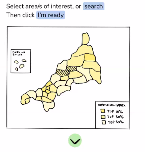
This comprises the "Lower Layer Super Output Area" or LSOA regions for the South West. These are relatively small local areas with average population sizes of 1500 people or 650 households, and are commonly used to make policy decisions for government agencies in the UK. We were told that officials will mostly know these by heart for their area, and will feel comfortable seeing them used in such a tool. The LSOA boundaries are published by the Office for National Statistics, and are a relatively large amount of data, so we used this map to select a region covering Cornwall to download the GPS polygon coordinates in the text based GEOJSON file format.
We set up a Postgres database on our server to hold all these tables of information in one place. For the LSOA boundaries we could import them using the "ogr2ogr" tool, which creates and updates a new database table for any given GEOJSON file.
Socio-economic information
One of the key requirements was to build climate justice issues into the core or the tool, by presenting Indices of Deprivation scores on our map. These scores are the result of many factors, including education levels, income, health and employment for the 1500 people in each LSOA. Again, we were told that people working on policy in local government are often very aware of these scores already, and would be used to see them used for this kind of decision making.
We obtained these from the Ministry of Housing, Communities and Local Government as a CSV file, again publicly available, and covering the whole country.
We needed to incorporate these for the LSOA boundaries we already had, so wrote an import script in python to add a new "imdscore" column to the existing boundary table and pull the values in that matched each LSOA identifier we were interested in.
Future climate model information
For the climate data we required the help of James Duffy who was working with the project to help access and process climate data in a form that we could use. We talk here of "climate variables" where a variable is a feature (e.g. wind speed or rainfall) that we expect to be significant in impacting human activities. After some discussion we decided the following climate variables would be a good starting point:
- Minimum, maximum and mean temperatures
- Minimum, maximum and mean wind speed
- Daily precipitation
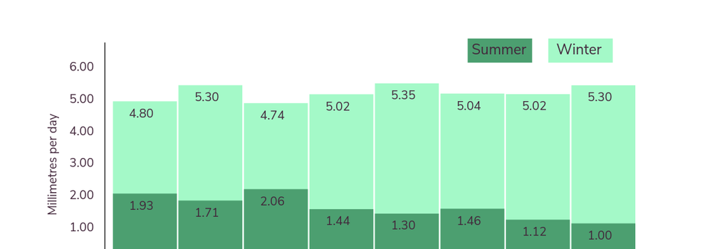
These variables are modelled into the future by the MET office in the UK, and are provided on an hourly basis. This is of course much too detailed for our needs, so James made these into daily averages for each variable and provided them to cover the next 70 years.
We wrote another python script to process these, and made three more tables in our database to cover:
- Yearly averages
- Averages for the three summer months
- Averages for the three winter months
The summer and winter averages give a better idea of the extremes that we are facing, while the yearly averages blur them a little. In the future we'd also like to provide a bit more detail - e.g. "number of consecutive days above/below this threshold".
Geographically, each variable is further split into 25km sized square "tiles", so we also need to match these up to the LSOAs so people can see the climate impacts specifically in their local region. We did this with a python script which calculates a GPS centroid for each LSOA, and then looks up which 25km tile it is located within. We then add yet another column to our LSOA table with the tile ID we can use later on.
The MET office climate data is directly accessible via the CEDA archive website but there are a number of caveats. The first is that you need to register and apply for the ability to download the data - which we could do as a non-profit organisation, but it's not clear how open it is. The second is that it is available in binary NetCDF files (which can be read in Python, for example) and stored in a slightly inconvenient manner that would take a long time to download. We didn't need to do this in this case, but I'm making a note of it here for anyone trying something similar, and us too, in case we need to come back to it in future.
Evidence for impacts
The evidence for how climate change variables impact on human activity is quite a different type of data than the previous sets. Ceren Barlas collected these by reviewing academic literature and noting down specific papers that indicated relationships between impacts. Ceren created a series of graphs using Kumu which included the climate variables linked to an impact, which cascade on to further impacts (and include feedback loops). To make things a bit more feasible in the time available, it was decided to limit these impacts for now to "active transport" (people walking or cycling as part of their commute rather than driving). For example, an increase in precipitation will decrease active transport, which will go on to decrease the proportion of people getting enough daily exercise, which will increase non-communicable diseases.
Each impact came with a short description and DOI identifiers of papers to reference for evidence. Ceren exported these for us as a CSV file, we made some tweaks and additions and made a python script to convert them to a JSON format text file including automatic lookup of the paper details (title, authors, journal details) based on the DOI from the doi.org API. At the moment we are embedding these JSON files directly in the client, but in future they are designed to be easily be moved on the database and provided at scale via our API (see the diagram below).
As well as the details above, each impact has a direction - this is whether it correlates positively or negatively with it's cause. This was quite complicated to display - as for example a fall in precipitation correlates negatively with active transport, causing it to rise. This was confusing to people using the tool as it wasn't clear if we were displaying the correlation relationship (-) or the predicted change (+), this is something we'd like to revisit.
Evidence for adaptations
These were also collected by Ceren, and are very similar to the impacts - each one is a climate variable and a direction linked to a potential adaptation, with descriptions and DOIs in the area of active transport.
Putting it all together
The flow we designed after the workshop (map - graph - impacts - adaptations) meant the core of the algorithm we needed to design was a kind of filter based on climate change direction. The user selects the LSOAs they are interested in along with a climate focus (seasonal or yearly averages), and it should provide a prioritised list of predicted impacts and possible adaptations for you.
It currently does this for active transport by using the estimated behavioural change factors for rain, wind and temperature to provide a simple prediction of how much active transport is going to rise or fall in your selected local region. The idea in future is this could then cascade down into each impact to give us a metric for prioritising the adaptations we suggest to the user.
In the event, our climate data was too geographically course to show much variation in regions, so the seasonal variations were a bit more important here - for example precipitation is predicted to significantly increase in winter and drop in summer. With higher resolution data we should see a lot more of this variation regionally due to micro-climates, and branching out to more topics than active transport we should see many more interrelated impacts too.
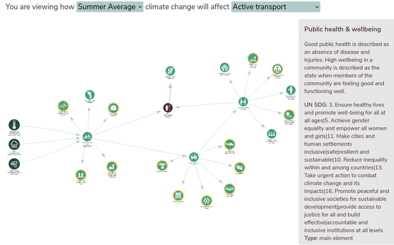
Even in this simple case the network created is extremely complicated, so we worked for a long time on how to filter or simplify this to make it clearer and less off putting for those that didn't need to see the complexity. In the end the best approach was to make it interactive, so you can expand each impact and explore deeper into the network depending on what you are interested in for your chosen area. This worked well when exhibiting it on a touchscreen for example.
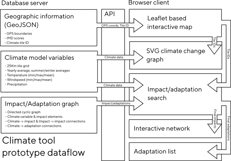
In terms of the technology involved, for the prototype we used Node.js for the server side framework, which we used to provide an API for the client to access. The client is written in JavaScript as well, and uses Leaflet for the map rendering (which we've used a lot for the Sonic Kayaks) and Vis.js for the network visualisation. We started with D3 to begin with, but while it was better for things like text rendering - it was less dynamic, so for more interactive uses Vis.js seems better.
Some future ideas
Given the (lack of) accessibility of the data we are using, one of the most striking things about this tool is realising how rare it is to consider climate change on such a local scale - to really think of it in terms of your street and community. We think there are a couple of key areas of interest in future - providing this data via an open API for people to use more widely, and perhaps standardising, or simply publishing a protocol of best practices in linking impacts together with adaptations across a range of policy areas.