
In 2021 we were commissioned to help researchers from the European Centre for Environment and Human Health and Cornwall Council to start bringing their idea for a climate adaptation tool to life. The tool was meant to give Councils, the NHS, and emergency services an idea of what climate change to expect in their area, what the impacts would be on health, and what adaptations to prioritise. The prototype we made is freely available online, was exhibited at COP26, and came Highly Commended in the Climate Challenge Cup - but, it was only a prototype. Now, further funding has been secured via Research England for expanding this tool as a collaboration rather than a commission. There are plenty of things we know need developing further and fixing (it's open source so you can see the accumulating to-do list on GitLab) - this post is to explore some of the biggest issues.
You can read about the tool development in detail, but in a nutshell it involves selectable map zones (with deprivation levels shown as default on the map), which then produce simple graphs of the future climate in the selected areas (based on 25km grid cells, up to 2090), which in turn produces a network of predicted impacts (with every node and connection based on published research), which in turn results in a list of suggested adaptations (again based on published research and including case studies). It essentially builds a custom explorable narrative for whoever is using it and whatever they are interested in.
The climate data is of course the foundation of the tool, as everything else is responsive to that. One of the most urgent things to do is to get better climate data - this is a bit out of our control as we're not the ones producing the data, but we're hoping for:
- Much smaller grid cells allowing for better microclimate predictions
- National scale data rather than only Cornwall
- Baseline data to provide better context for just how much change is happening
Interestingly we've heard that people are already using the tool to get access to climate forecasts, as this data is shockingly difficult to find in accessible formats. So this aspect might turn out to be one of the most broadly useful parts of the tool.
While most of the tool is really straightforward, one part we know needs work is the explorable network of impacts resulting from climate change. There are lots of problems here! The network is already large even just with one case study used for the prototype, so it has to be responsive and expandable. We knew this from the offset, so we made it so people can click on nodes and connections to expand them and get further information and open up new parts of the network to explore - rather than dumping all the information on people in one go.
We joined the project after quite a bit of data collection had already happened, which is always trickier than having input into how the data is collected if you're trying to build something based on that data. Because of this, the data wasn't in a format that lent itself to simplification, and certain types of necessary data were missing, so another foundational bit of work will be getting an agreed fixed data format in place. The additional benefit of this further down the line might be that we could build an interface so that updated or expanded data can easily be uploaded straight into the tool.
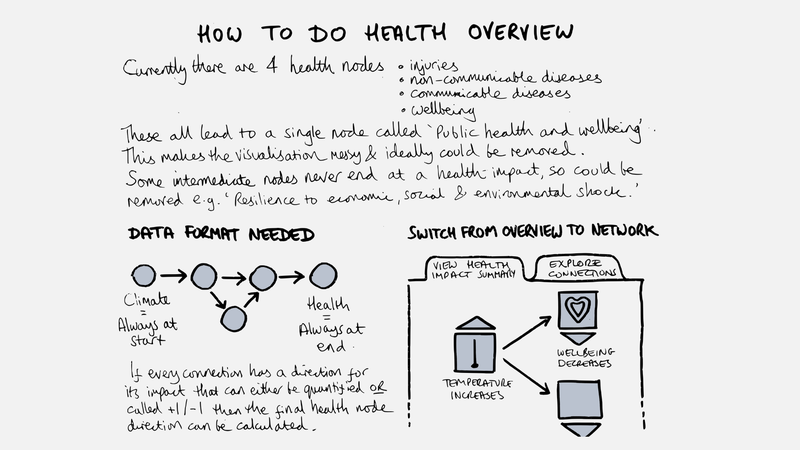
We, and the other partners, want to get to the point where the climate impacts are shown as an overview that is quick to interpret, but that can then be explored in more detail. There are lots of considerations involved, but the foundation is that the data needs to be collected in this format:
Climate Variables (e.g. rainfall) -> Impacts (might be lots, in a complex network) -> Health Outcomes.
If (and it's a big if) we can get quantitative data for each connection between the different impacts, or we can use a crude +1 or -1 approach for 'this thing increases this other thing' or 'this thing decreases this other thing', then we should be able to visualise impacts in a very accessible way, but we're not sure this is totally legitimate yet and need to talk to the researchers about it:
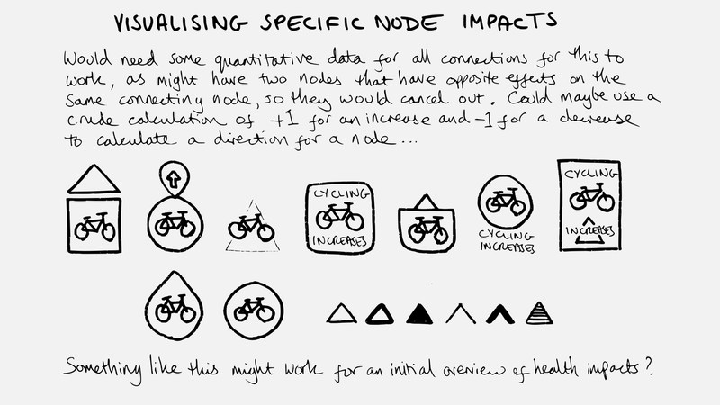
A related current issue is that we don't have any information on the impacts of the climate variables decreasing as opposed to increasing. Climate forecasts aren't always as straightforward as the headlines imply, for example winter rainfall is likely to go up, but summer rainfall is expected to fall (halving in parts of Cornwall in the next 70 years) which adds a level of complexity to the impacts we'll be facing.
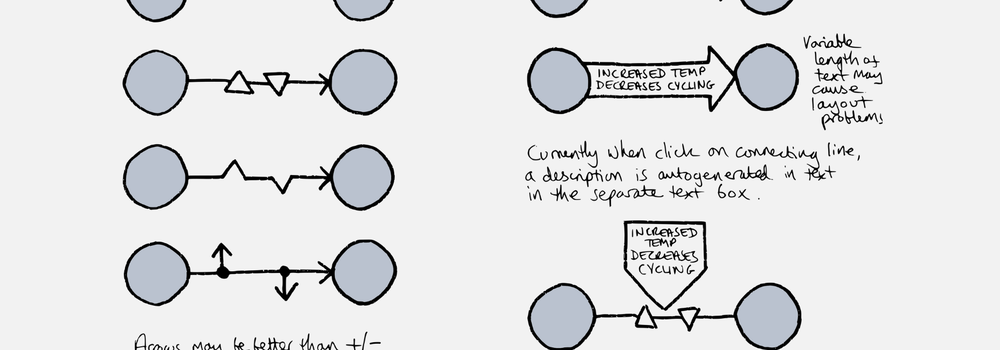
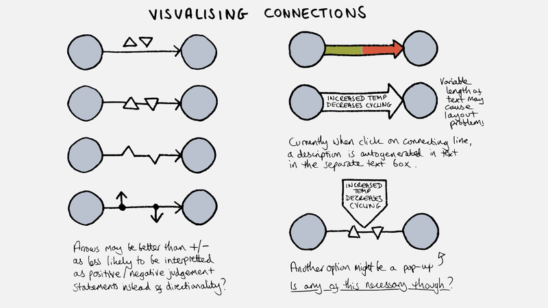
In the explorable impact network, we need to be able to clearly display four types of connection:
- Variable 1 goes up, causing variable 2 to go up (+ > +)
- Variable 1 goes up, causing variable 2 to go down (+ > -)
- Variable 1 goes down, causing variable 2 to go up (- > +)
- Variable 1 goes down, causing variable 2 to go down (- > -)
This might sound easy, but in terms of responsive data visualisation it's a bit of a challenge. The only example we've found that we think gets it close to right is Loopy by Nicky Case, and we've been sketching some different ways of doing this:
There are, of course, lots of other things to add to the tool, and the scope of this phase will almost certainly evolve depending on the core team and stakeholder group's priorities. We're also keen to nudge to project further towards co-design, as to date it's been more of a stakeholder consultation model - we've found this little co-design walkthrough really useful for helping understand the difference.